Widows and orphans should disgust you
Let’s talk typography. This post will explain what widows, orphans, kerning, tracking and leading are. I must admit, the terms “orphan” and “widow” are a bit odd, but I promise it will make sense and you will understand why typographers came up with those terms. Don’t be offended if you overhear a designer saying phrases like “get rid of that widow,” and “make sure there are no orphans.” If you didn’t know what we were talking about, you would think all designers are cruel, heartless people. In reality, we do love literal orphans and widows, just not typographic orphans and widows.
WIDOWS
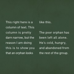
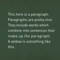
Widows and orphans are terms used when talking about a paragraph of text. A widow is a short line of text (usually only one word) at the end of the paragraph. In other words, if you are typing along and the last word of your paragraph ends up dropping to a new line, it’s time to either add more text, adjust the tracking or change the paragraph size so that that last little word can nestle itself up against the rest of the paragraph and not be a poor, lone widow. Get it?
ORPHANS
Orphans are similar to widows. An orphan can be one word, or a short line of text that is leftover from the previous paragraph but at the beginning of a new column or page. Now, you are probably wondering why orphans and widows are such a big deal. The honest truth is that they are just plain ugly. It makes a beautiful, healthy-looking paragraph look sloppy. Like if you saw a nicely dressed man in a pinstripe suit and fancy-looking tie with a big giant mustard stain on his collar. It’s distracting and awkward. Be nice to your paragraphs. Don’t allow widows and orphans to creep in. Now, I understand that sometimes (especially in web format) you cannot always control widows and orphans, so if you see one in this blog post, please do not think I am a giant hypocrite.
KERNING
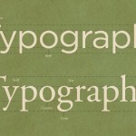
Kerning is the space between letters. Some letters have awkward spacing between them when they are together. For instance, “AT” or “AV” have more visual space between them then the other letters in the word. It’s like “A” told “T” that he liked her but “T” doesn’t have the same feelings back. So as a designer, you unfortunately have to make “A” and “T” look good together. So we give them a little talking to and adjust the kerning. Then the whole word looks good again.
TRACKING
Tracking is pretty much the same thing as kerning except it adjusts the whole line’s spacing between the letters, not just between two individual letters. A font in all caps with a generous amount of tracking can be very attractive. Sometimes you have to adjust the tracking to get rid of those darn orphans and widows I was talking about before.
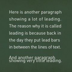
LEADING
Leading is the space between each line of type. It’s nice to be able to increase the leading a little more than what your computer thinks should be used for your paragraph and give it a little more breathing room.
The unifying theme when talking about widows, orphans, kerning, tracking and leading is visual spacing and consistency with type. As a designer, I try my very best to keep the spacing and overall look and feel of the type consistent. Just remember to take a look back again at the copy you have just written and make sure there isn’t anything visually distracting or just plain ugly.
![]()