Hand lettering in advertising

Fonts are everywhere. With rigid, repetitive, exact letters. Don’t get me wrong—I love digital fonts—but it is definitely nice to look at some old-fashioned, drawn-with-love hand lettering. Hand lettering is so attractive because of the uniqueness of each letterform. It is the mistakes and inconsistencies in the letterforms that give it such an expressive personality and make the design look distinct and stylized.

Read more

Widows and orphans should disgust you

Let’s talk typography. This post will explain what widows, orphans, kerning, tracking and leading are. I must admit, the terms “orphan” and “widow” are a bit odd, but I promise it will make sense and you will understand why typographers came up with those terms. Don’t be offended if you overhear a designer saying phrases like “get rid of that widow,” and “make sure there are no orphans.” If you didn’t know what we were talking about, you would think all designers are cruel, heartless people. In reality, we do love literal orphans and widows, just not typographic orphans and widows.

Read more

Dotting the I’s and crossing the T’s: An intro to typography

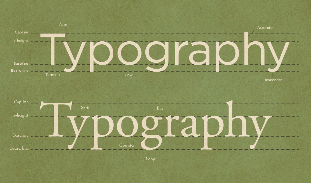
What is typography? Typography is the art and technique of arranging type in order to make language visible. It is the most intense form of visual communication and deals with fonts, specific typefaces, alignment, paragraph forms, font weights and so forth. With the availability of the computer and word processing software comes a flood of fonts—good and bad—but not all fonts are created equal. My hope in writing this blog post is that you will think twice before using every font installed on your computer the next time you need to create something.

Read more