Dotting the I’s and crossing the T’s: An intro to typography
What is typography? Typography is the art and technique of arranging type in order to make language visible. It is the most intense form of visual communication and deals with fonts, specific typefaces, alignment, paragraph forms, font weights and so forth. With the availability of the computer and word processing software comes a flood of fonts—good and bad—but not all fonts are created equal. My hope in writing this blog post is that you will think twice before using every font installed on your computer the next time you need to create something.
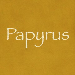
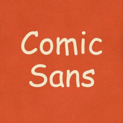
Many basic word processor users are overwhelmed at all the different fonts available to them at just a click of a button. Many people think that because they have so many choices they must exercise their ultimate font power by putting as many terrible fonts on one document as possible. My word of advice: don’t get crazy. Just because your computer has Comic Sans and Papyrus doesn’t mean you should use them. Don’t be a Comic Sans criminal.
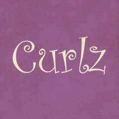
Think of it this way. Not only does communication come from the word the typeface is spelling, but it also comes from the form of the typeface itself. So if you want to come across as an expert on something, refrain from using Curlz. Even if you own a beauty salon.
As a designer, it is imperative that I use a typeface that will communicate the desired message as effectively as possible. Each design calls for a different typeface. For instance, I wouldn’t use the same typeface for a poster promoting a circus that I would use on a mortuary website.
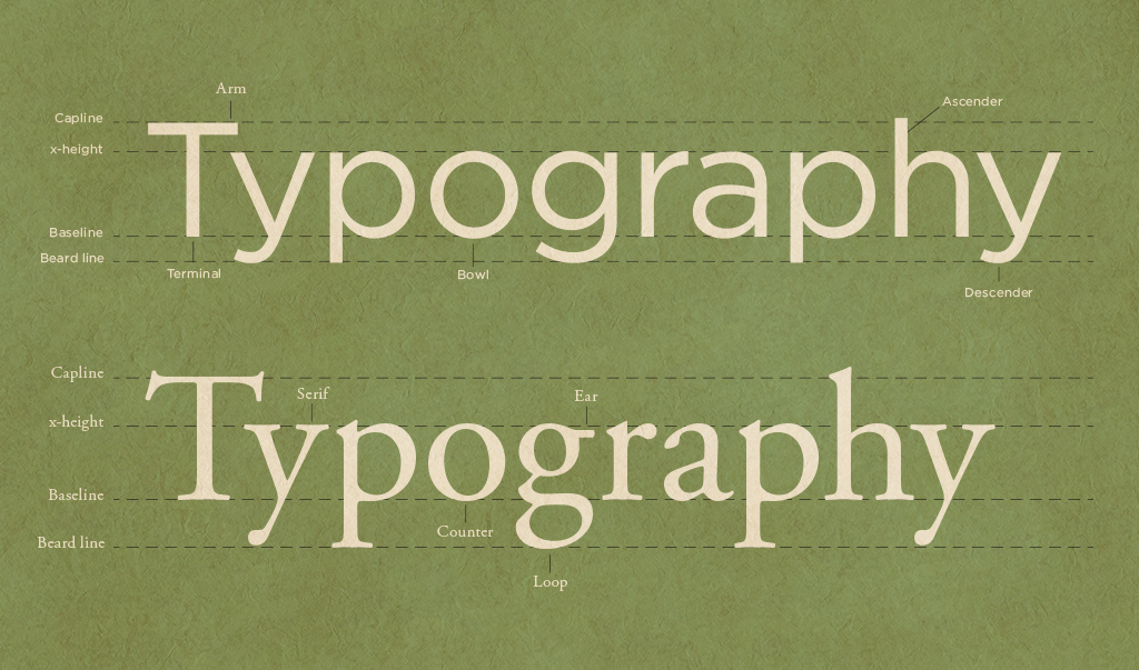
Most typefaces can be divided into two different categories: serif and sans serif. Refer to the header image for examples of both. Serifs are the little short strokes or “feet” coming off of the letterforms at an angle. Sans means without, so sans serif literally mean without serifs. Sans serif typefaces are often very geometric and modern. Serif typefaces are generally used as body copy in books or magazine articles and tend to have a more classic look. Some good examples of sans serif typefaces are Din, Univers, Akzidenz-Grotesk and Gotham. Some awesome serif typefaces are Garamond, Goudy, Clarendon and Archer.
As you will notice, none of these fonts can be downloaded for free on dafont.com. That’s right, folks—a good font costs money. Why? Because creating a well-designed typeface takes a lot of skill and time. So what makes these typefaces so much better than the others? Legibility, structure, balance, and a good use of positive and negative space. They look professional, not hokey.
The following typefaces should be avoided like you would a contagious disease:
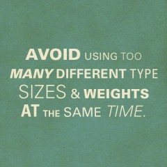
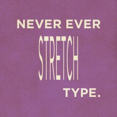
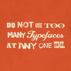
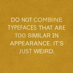
A few final tips:
My hope is that you gleaned some interesting insights into the wonderful world of typography, that you swear on your life to never use Papyrus and that you might restrain yourself from adding another font to that family newsletter you’re writing. I have only scratched the surface of typography. To learn more about kerning, leading, widows and orphans stay tuned for my next blog post about typography.