Hand lettering in advertising
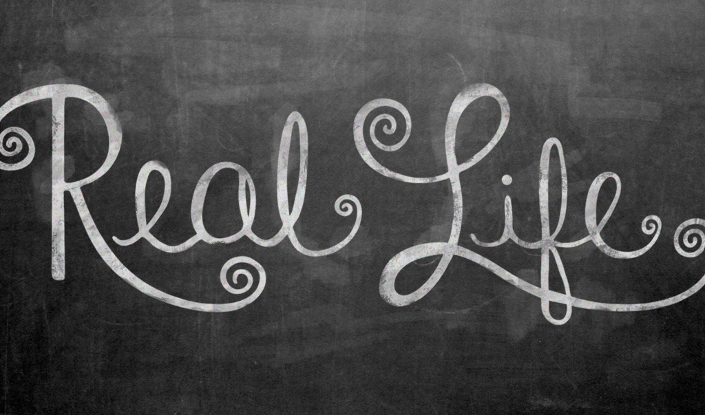
Fonts are everywhere. With rigid, repetitive, exact letters. Don’t get me wrong—I love digital fonts—but it is definitely nice to look at some old-fashioned, drawn-with-love hand lettering. Hand lettering is so attractive because of the uniqueness of each letterform. It is the mistakes and inconsistencies in the letterforms that give it such an expressive personality and make the design look distinct and stylized.
Hand lettering brings out the human touch in a design. It also allows interaction between letters to occur that wouldn’t normally happen when using a font on the computer. It’s almost like digital fonts are too perfect and lacking in personality. I believe that is the reason why hand lettering is exploding in popularity.
It’s just that digital fonts are so easy to get. They are handed out like Saturday samples at Costco to anyone who can click a mouse. I cringe a little every time I see my non-designer friends pin a list of free fonts to Pinterest. It’s not that I am a heartless typography control freak (or maybe I am); I just know that those fonts probably won’t be put to the best use. You can steer clear of having your advertising or marketing pieces look average and boring, full of free fonts. Hire a designer or design firm that is absolutely incredible with typography and hand lettering to really add personality and charm to your promotional pieces.
Many large companies have commissioned hand-lettering artists for ad campaigns. Check out these beautiful examples of hand lettering in advertising for Canon, McDonalds, Rugby Ralph Lauren, California Pizza Kitchen, and Chipotle. (If I have forgotten any, please leave a comment with a link!)
I personally think good hand lettering is absolutely stunning. Although it is incredibly challenging, I really enjoy dabbling in it. I wish I was better at it and I want to continue to learn how to hand letter better. If you are also interested in learning how to hand letter, I found this cool website.


